What Should a Law Firm Website Include to Turn More Visitors Into Consultations?
A law firm website does not need to feel clever. It needs to feel clear, trustworthy, fast, and easy to act on.
People visiting a legal website are often dealing with something stressful, expensive, urgent, or unfamiliar. The site should reduce uncertainty—not add another layer of it.
If I were reviewing a Southern California law firm website for conversion, these are the pieces I would look at first.
Make the practice area obvious immediately
A visitor should not need to decode a slogan to figure out whether the firm can help.
The top of the page should quickly answer what kind of law you practice, who you represent, where you serve clients, and what action someone should take next.
“Committed to excellence and justice” may be true, but it does not tell someone whether you handle immigration, personal injury, family law, employment, criminal defense, or business disputes.
Specific beats impressive.
Give important practice areas their own pages
One generic Services page usually is not enough for a firm with multiple meaningful practice areas.
Separate pages make it easier to explain the legal problem in plain language, answer common questions, show what the process looks like, establish relevant experience, link to related resources, and create focused calls to action.
The goal is not to create hundreds of thin pages. It is to give each meaningful service enough room to be useful.
Put trust where the decision happens
Law firm websites often bury trust signals on an About page. Potential clients are evaluating the firm on every page.
Useful trust signals can include attorney bios, years of relevant experience, bar admissions, languages spoken, real office information, authentic reviews where appropriate, professional memberships, and case results when ethically and legally appropriate.
Do not make people hunt for proof that the firm is real.
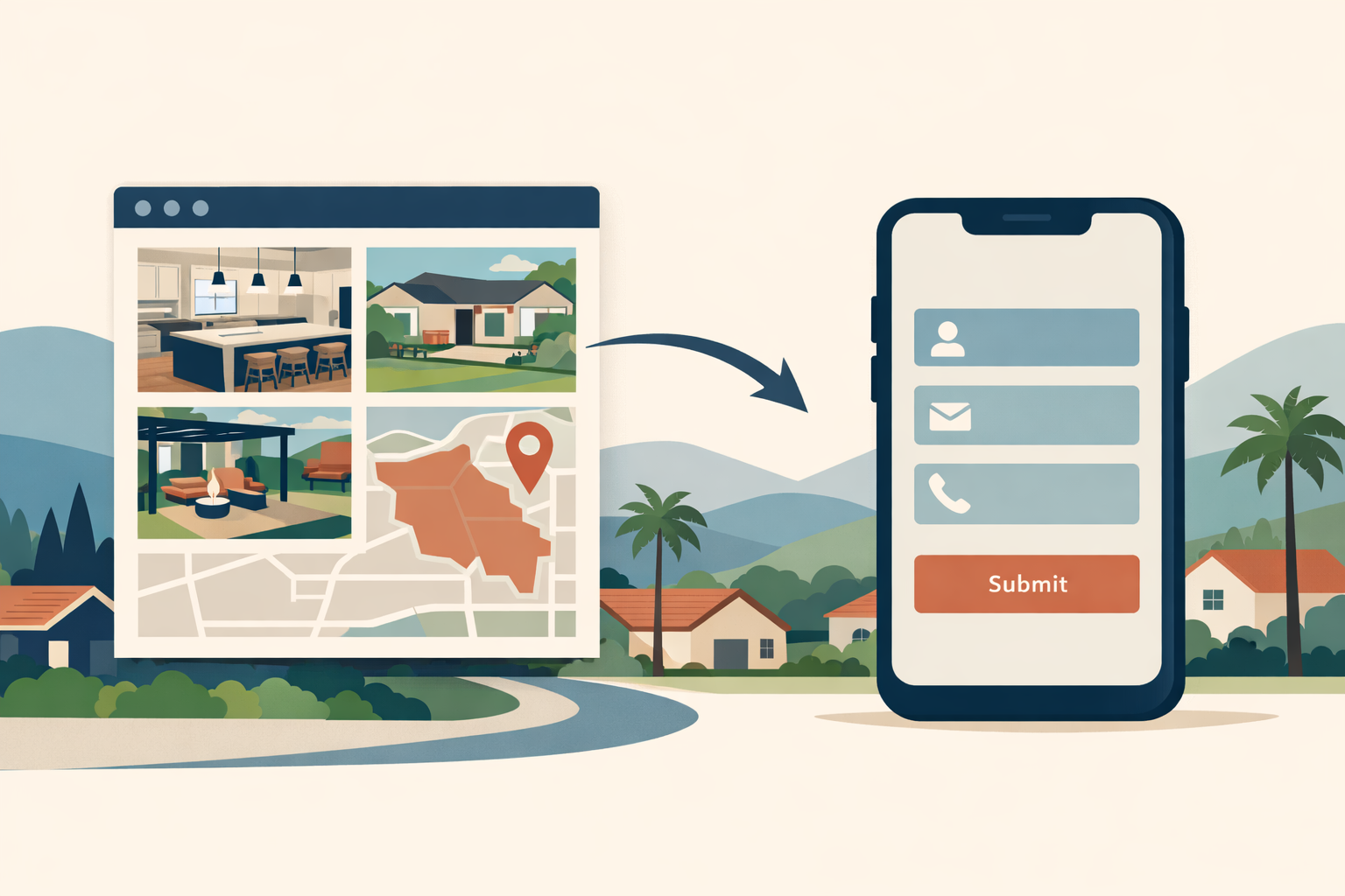
Make contacting the firm easy on a phone
For many legal searches, mobile is the entire experience.
Can I call without copying a number? Can I find the intake form quickly? Does the form work with one thumb? Does it ask for twenty fields before I know if the firm can help?
A form should collect enough information to route the inquiry—not conduct the entire consultation.
Explain what happens after someone contacts you
This small section can reduce anxiety.
For example:
- Tell us briefly what happened.
- Our team reviews the inquiry.
- If it looks like something we can help with, we schedule the next step.
The exact process varies by firm. The important part is that the person understands what they are opting into.
Use bilingual content intentionally
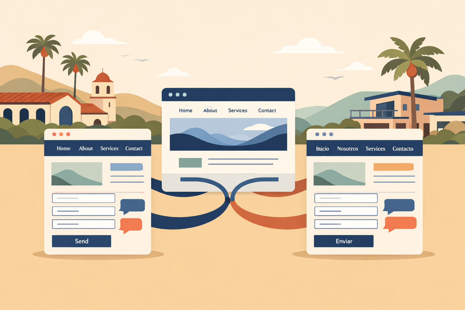
In Southern California, bilingual websites can be a real business advantage for firms that already serve Spanish-speaking clients.
But bilingual design is not just running every paragraph through a translation tool.
Think about navigation, calls to action, forms, confirmation messages, attorney bios, FAQs, metadata, URLs, and who maintains both languages after launch.
The Spanish experience should feel like the same firm—not a secondary copy of the English site.
IRVING INPUT OPPORTUNITY: Add one specific lesson from building a bilingual law-firm website: a decision about navigation, intake, practice-area structure, or English/Spanish content that other firms would find useful.
Build the site around questions clients actually ask
A good legal website does not need to give legal advice online. It should answer the non-sensitive questions that help a person understand whether to contact the firm.
Examples include: Do you handle this type of case? What areas do you serve? Do you offer consultations? What languages does your team speak? What should I prepare before contacting you? How does the process generally begin?
Useful FAQs support humans first. They also make a page easier for search systems to interpret because the subject is explained more completely.
Show the attorneys like real people
A stock photo of a courthouse does not create much trust.
Potential clients want to know who may actually handle the matter.
A strong attorney bio should make role, practice focus, background, relevant credentials, languages, approach, and professional photo easy to understand.
Professional does not have to mean impersonal.
Make location information specific
If the firm serves Riverside, Los Angeles, San Diego, Orange County, or multiple Southern California markets, say so clearly.
But avoid building dozens of identical city pages with the location swapped out. A local page should have a real reason to exist, such as an office, meaningful client base, local process information, or unique resources for that market.
Geography should clarify the firm's reach, not become a page-generation trick.
Content can start before someone is ready to call
Some potential clients are ready to contact a lawyer immediately. Others are still figuring out what kind of help they need.
Useful articles can answer early questions and introduce the firm before the person reaches the decision stage. The content should be genuinely useful and carefully reviewed for accuracy.
Technical quality still matters
A law firm website should also have solid fundamentals: fast mobile performance, crawlable pages, clean page titles, logical headings, sensible URLs, internal links, accessible forms, image optimization, analytics, a sitemap, secure hosting, and predictable maintenance.
None of these replaces good legal content. They make sure the content has a solid delivery system.
What I would prioritize first
If the budget does not allow everything at once, I would prioritize clear positioning, practice-area pages, mobile contact, attorney credibility, intake flow, bilingual UX where relevant, local/search foundations, and then ongoing educational content.
The first goal is always the same: make it easier for the right person to confidently take the next step.
FAQ
What should be on a law firm homepage?
Clear practice focus, service area, attorney or firm credibility, a simple next step, and links to the most important practice-area pages.
Should every practice area have its own page?
Important practice areas usually benefit from focused pages when there is enough useful information to justify them. Avoid thin pages created only for keywords.
Does a bilingual law firm need a full Spanish site?
If Spanish-speaking clients are a meaningful audience, core pages and the intake flow should be intentionally supported rather than relying on an incomplete translation layer.
The bottom line
A law firm website should not feel like a digital brochure. It should function like the front desk before someone reaches the front desk.
Orient the visitor, answer the obvious questions, establish trust, and make contacting the firm easy. If those pieces work, the design can stay clean and simple.